During my 4 years at Meetoo Interactive, the company evolved from a BIM+IoT-based hospital logistics data visualization platform to a comprehensive “Hospital Operation and Management Solution”. I have participated in the product’s transformation from data visualization to a data-driven management.
Facility management in a hospital is akin to managing personal health. Similarly, we are faced with various types of data, curious about how they interconnect with each other, and based on which we want to make rational, data-driven decisions to improve the health. The difference is that hospital managers deal with significantly larger volumes of data and with more complex interrelationships.
How do we balance between efficiency and data integrity?
How do we go from charts to action?
These are the core challenges we have when shifting towards a management tool and they are the context of this Data Navigation feature that I have led.
I was the only product designer from initial concept to execution. User research, interaction design and validation, prototyping and UI design were all that I was accountable for.
Meanwhile, I was facilitating meetings with the team along the process to align design objectives and get feedback from team members.
Time Span: 2 month (Jul 2023 to Sep 2023)
Team Size: 1 product manager, 3 software developers, 1 product designer.

Every month, I conduct client follow-ups and internal product reviews. Throughout the process of onboarding new clients, I’ve identified two significant usability issues that consistently arise during our discussions:
Facility Maintenance Manager
Roles:
Serve as the central hub for campus operations, comprehensively maintenance across all building systems.
Use operational data to plan future tasks then delegate to individual system operators.
Client&Project Manager
Roles:
Oversee project timelines and quality, report product deployment progress and updates to clients.
Communicate product value with client training sessions and cultivate client dependency.
Identify crucial chances for cross-selling and up-selling.
Facility Maintenance Manager
“I can be overthrown by the features and data at hand.
I don’t know what are the most important information to me.”
“The interface has a lot of information, which is understandable for a management platform. But I can be overthrown by the features and data at hand. Thus sometimes I don’t know how and when to use them. I don’t know what are the most important information to me at the moment.”
Client&Project Manager
“I have to click too many times switching from one module to another thus it’s hard to convince our clients that our data is integrated for complex analysis.”
“The modules are too isolated but one of our product values lies in data integration. Currently, I have to click too many times switching from one module to another. This is frustrating especially when I present to clients, I find it challenging to demonstrate to our clients how the various data can be integrated for a comprehensive operational analysis.”
Narrowing the Scope
Our UI layout doesn’t give space for user-friendly navigation system.
Even though the feedback is vague and generic, they are telling us two things:
Users don’t know how to navigate through various informations.
Users have trouble switching modules.
The feedback resonates with a hunch which I’ve been having for a while: The product has a UI layout that doesn’t give space for user-friendly navigation. It has caused confusion among our new users.
The feedback from the monthly follow-up and review needs more details so that our team can identify specific design opportunities. I develop a research plan to gain more clarity:
Step1:
Observe to uncover frustrations
Work with Facilities Managers and Client Managers and observe for a week.
How do they work based on their daily SOP and MT products?
What actual challenges and frustrations come up in their work?
What actual challenges and frustrations come up in their presentations?
Step2:
Ask questions based my observation
I noticed that you did XXX (an action implying confusion and frustration). Can you explain your thought process behind this action?
Did you get the result you are looking for? Is there any confusion on the interfaces?
The user research validates my hypothesis: Our users have a hard time navigating our product and there is one UI element that is especially unfriendly - our Top Bar.
The Top Bar becomes the most convenient place for features that we don’t know how to categorize.

Dissecting the UI Layout
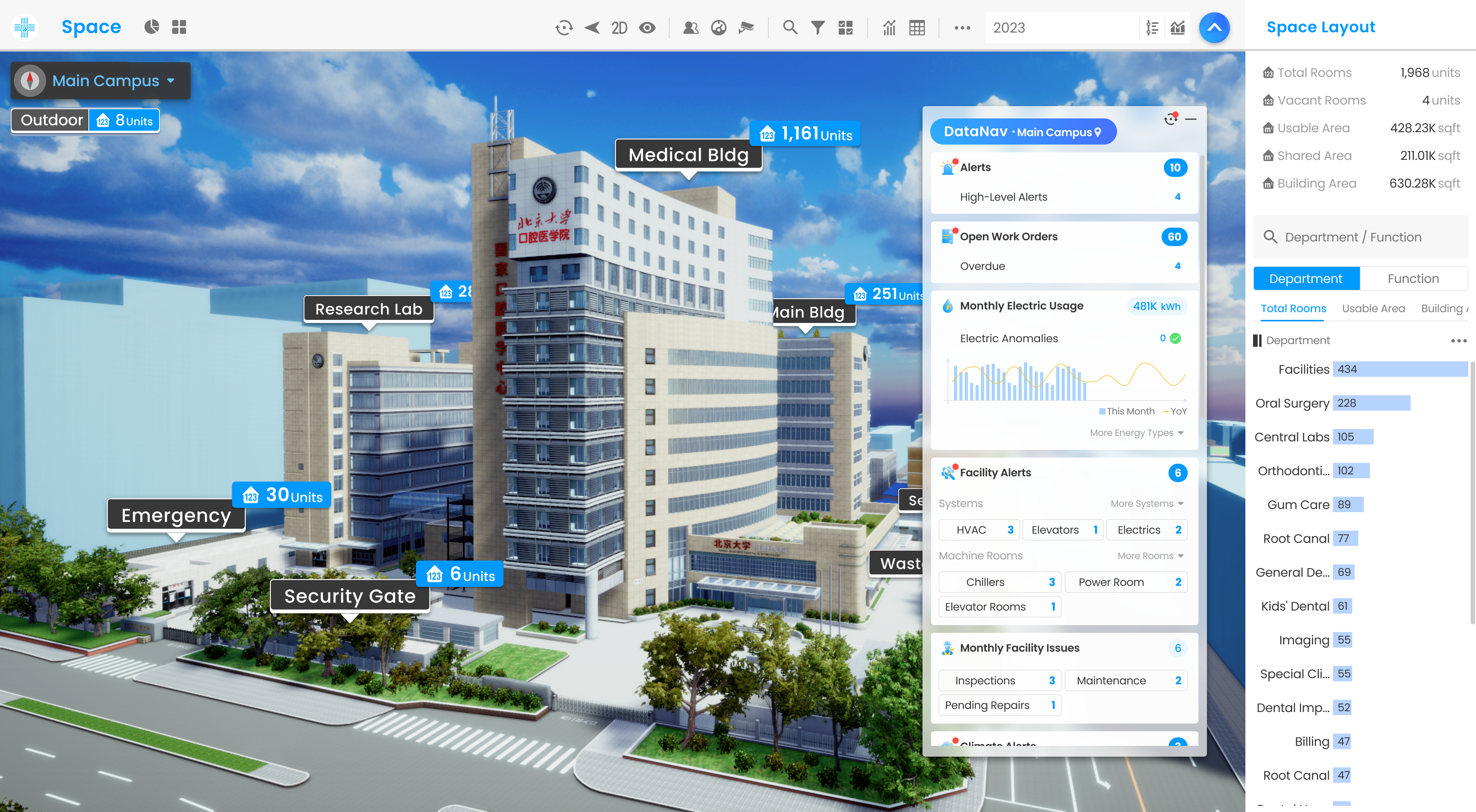
In our current UI layout, the Building View simulates real campuses and allows users to navigate through various locations (such as levels, buildings, and campuses). The right panel provides information and statistics specific to the selected location.
As there are only three key sections in the UI layout and the functions of Building View and Right Panel are clearly defined, the Top Bar gradually becomes the most convenient place for features that cannot be integrated into the Building View or Right Panel.
1. The navigation is too far apart to distinguish

The Current Nav Entrance
Too far: Navigation is one of the most frequently used functions but it is located at the top left while users usually focus on the right since the right panel contains most of the information.
Too many: Too many icons in the Top Bar to make any of them identifiable.
2. Wordings are too technical.
The wording for navigation is too technical. Users find the terms hard to align with their daily tasks. For example, we focus on open work orders, not CMMS; we monitor facilities alerts and issues, not EAM; we identify energy anomalies, not EMS...

3. Users don’t know how to prioritize their tasks.
Seeing all the module entrances, users still lack the motivation to click on any of the icons, especially our new users who are not proficient with the product. If they don’t see operational data and KPIs, they don’t know where to focus or how to plan their tasks for the day.

The Current Navigation
4. Too many clicks and too little integration.
A general question from Facilities Managers: An AHU repair overdue might have caused an energy anomaly in the relative region. How do I switch between work order and energy usage of the month? ——The current answer is by clicking 7 times all over the screen.

How We Approach the Issues
The Original Navigation

Iteration 1
A New Interaction
The first thing we did was test out a new interaction flow. We discarded the overlay and shrank the space taken up by the nav, making sure that our user can dive into one operation while knowing what other modules are at hand.
What KPIs do Facilities Managers value?
We have all sorts of statistics in our product, so let’s try putting them all in.
Why do Facility Managers use the navigation? Their motivation lies in their KPIs—the navigation should provide things that interest them.
Now, here comes the challenge: What KPIs do Facilities Managers value?
Even though this piece of the puzzle is still missing (sadly, it will not be obtained overnight), I decided to go with what we already had—we have all sorts of statistics already in our product, so let’s put them all in (not exactly a smart idea when I look back, but at that point, I had a very tight deadline).
Iteration 2
Adding Sum Data

Iteration 3
Sum and Breakdowns

I suggested redesigning the UI layout to improve navigation. Meetoo’s product has transformed from a building visualization tool to a comprehensive management solution. Yet the UI layout still emphasizes 3D visualization, leaving no space for a navigation system to guide 2D-based management workflows.
However, changing the layout will substantially impact the interactions we have been using for years. Our team considered my proposal too radical at the time, so we kept our new navigation in a floating window.
User Testing for Further Improvement
User Engagement
How frequently do users engage with the navigation to guide their workflow in the working environment?
On the quantitive side, this data is gathered from our event tracking system. Qualitatively, I will observe users’ behavior to get a sense of the frequency.
Cognitive load
Our ultimate goal is to reduce the time it takes to complete tasks with the new navigation. I've intentionally reduced the mouse clicks and moving distance.
However, the cognitive load added due to breaking users' old habits is still uncertain.User testing and interviews will clarify the uncertainty.
The unexpected benefits
Will users operate our new navigation in unexpected ways to gain more benefit? I’m very curious to observe.
The New Interaction Is Better Than the Overlay
During the interview, all the users admit that they prefer the new floating window to the original overlay since the module transition feels easier and more smooth.
It Works Well for Project&Client Managers
Our new design helps managers win recognition during presentations. Now the clients can easily comprehend how data from various sources is integrated into one platform.
According to my observation, our managers tend to fold the breakdown in meetings and only unfold the sections they are focusing on - it implies information overload. Nobody complains about it but I do think we should make improvements later on.

Folded and Unfolded Breakdowns
User Engagement Rate is not Ideal
Our data shows that Facility Managers are still attached to the old interaction when switching modules.
Throughout the follow-up interviews, it’s easy to see that users are dealing with tremendous information overload - the proportion of clicked data to displayed data is too low.

Important information (Blue areas) is too little
A Story of Integrated Analysis - we are almost there, almost
During my user interview, one of our project managers (and an advanced user of our product) tells me the story of her finding the interconnection among data when using the new navigation. And it has effectively impacted her future preventive maintenance strategy:

What I Learn from the Story
At this point of user research, I realize that our Facility Managers’ responsibility consists of two parts:
A. Daily To-Dos - This can be generalized into a series of Standard Operation Procedures.
B. Analysis and Decision-Making - Tasks that greatly rely on senior-level experience.
Therefore, if we want the Facility Managers to navigate better in our platform, we have to tackle the questions below:
How might we help Facility Managers spot and complete daily to-dos more efficiently?
How might we uncover interconnections between data to drive rational maintenance decisions?
Reduce Information Based on Managers’ SOP
I gather our users’ working documents to analyze their daily work process and then generalize them into Standard Operation Procedures.
With these research materials, we can answer the previous question: Now we can leverage these SOPs as KPIs. Our team can better filter out irrelevant data in the next iteration phase.

A peek into users’ working documents

Generalized user work flow
Add Status Indicators
Even with Standard Operation Procedures, our users don’t necessarily have to go through all the procedures one by one daily.
By adding status indicators, we can further notify Facility Managers what their top priorities are among multiple SOPs - Somedays they have to focus on Energy Anomalies, other times overdue work orders are too much that they have to deprioritize resolving alerts.Users should navigate through their tasks better with our guidance.

A quick idea for red badge indication
Iterate, Iterate, Iterate
We have a legacy interaction model within the product. Users can use three filters to access information from our database - Time. Location. Module.

4 granularity: Year, month, week, day.
At a time span at least for 2 years.
4 granularity: Campus, building, level, room.
Approximately 2,000 rooms for each campus.
6 to 12 modules for each client.
Users must manually set the time, location and module by themselves in our old interaction. This interaction module works well when our users need to analyze trends and patterns or craft an annual report thoroughly - since they specifically know what data they want to access.
But when they deal with new tasks, they want the system to inform them. Since the time, location and task detail are unpredictable, it’s so hard to dig out new tasks among large volumes of data.
For data on the navigation, on the other hand, we can select the time, location and module filter for our users based on their SOP. In this way, the volume of data is substantially reduced.

Real-time Status: For Assets with IoT Sensors.
Monthly Overview: Crucial milestone in facility management. Focusing on trends, MoM and YoY.
Full History: For keeping track of unfinished tasks.
The Whole Campus: Informing users if all the tasks are completed for the day.
Rearrange module order to align with clients’ objectives:
Safety: Alerts
Efficiency: Work Order, Energy, Facilities
After convincing the team of this core logic, I started to refine every section, module by module. Along the process, I leverage all the existing features and data in order to reduce my engineer colleagues’ effort to build.

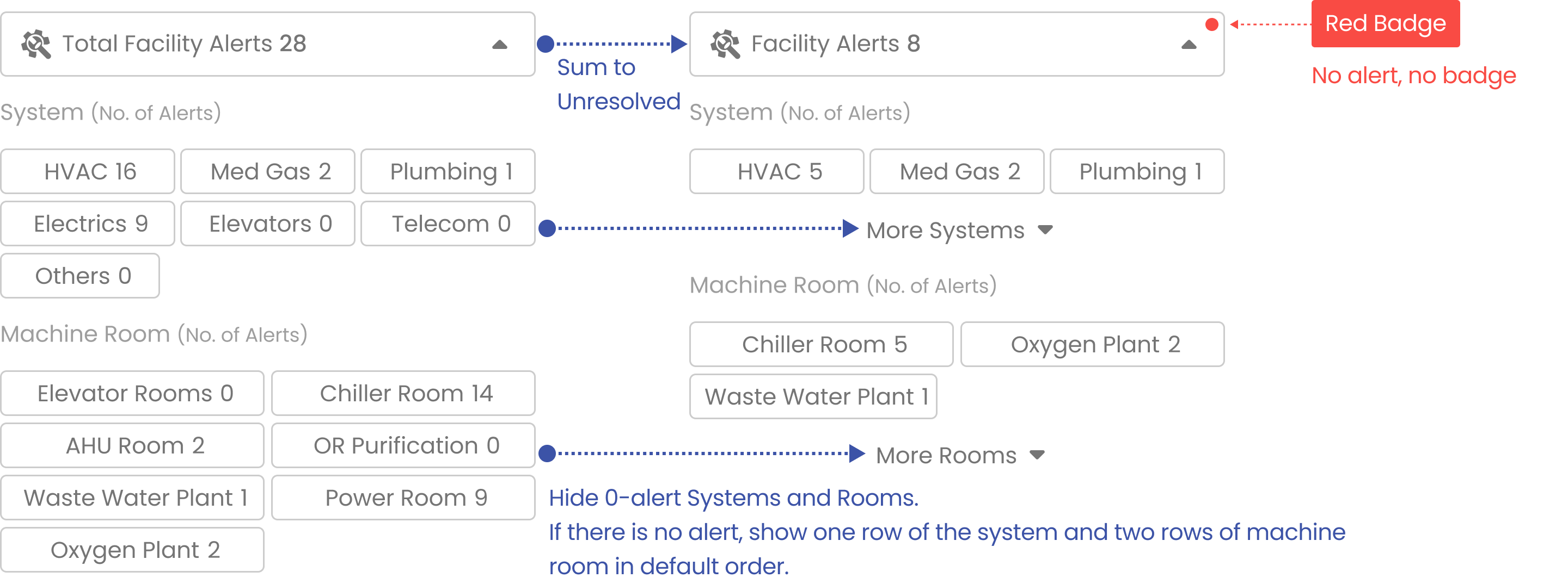
Emphasizing Unresolved Alerts rather than Sum. At the same time showing the number of unresolved high-level alerts.


Large numbers of energy usage are usually easier to comprehend with visualization. By adding time series bar charts, YoY and MoM, it becomes easier to spot and understand energy usage and how anomalies happen.
Breaking Facility Management into Alerts and Operations
Facility management is a complex project that involves various types of work; therefore, it’s hard to unify all the KPIs under one headline. Dividing one huge chunk of information into alerts (IoT) and Operations (manual tasks) can help us gain more clarity.


The Data on the navigation can be filtered by locations, which means multiple touch points in one interface, making it difficult to predict our users’ next step—they can either jump to another module within the same location or jump to another location within the same module.
Therefore, I decided to design the interaction flow using one particular user story and then apply it to other scenarios to test whether the interactions are still valid and usable.

Collapse/Expand when Necessary
Since we can't change the UI layout, the right panel, building views, and data navigation may compete for users’ attention. To address this, we can use a collapse/expand feature to save space when users focus outside of the navigation.

In the collapsed mode, users can still spot unfinished tasks with red badges. Data will be popping up accordingly while hovering on module icons in order to reduce clicks and mouse movement.

Real-time Updates: Data Nav is Refreshed as Tasks are Completed or Added
Data Nav should be updated immediately to provide users with accurate guidance on what to do next.
Notifying Unfinished Tasks beyond the Current Location
Data on Navigation changes based on users’ location to provide finer granularity. However, this will block the bird' s-eye view of the whole campus.The Data Nav has to notify the campus’s overall to-dos despite users’ current locations.
I leverage the existing feature - Reset to Campus View - with Red Badges to show campus-wide to-dos.Since users are already familiar with the icon button, adding a Red Badge to the icon is intuitive.